

ObiJanKenobi
*Snickerdoodle*, *GingerScraps Ad Team
Mary left a comment on the tutorial Chalking it Up to Inspiration where she asked for some tips on using those alphas that come with many designers’ kits. She said she found them difficult to use and needed some tips for using them effectively. So that’s what we’re going to talk about today.
When I first started digi-scrapping, I didn’t use kit alphas much because, like Mary, I found them cumbersome to work with. So many things about my workflow have changed over the years and I’ve found some methods that really work for me, so I’m going to share some of them with you today. One of Mary’s comments was about finding them. Each scrapper is going to do things differently according to how they organize information in their heads, so the following is meant as a suggestion, not a directive.
I’ve read a lot of posts in various places about organizing supplies and I’ve tried lots of methods. The one that works for me best is to use folders. I make folders for everything! When I unzip my downloads, I try very hard to organize them right away; I rename them with the designer’s name and kit name then move them into the folder I’ve created for the store where I bought them. My GingerScraps folder is HUGE!! I also take everything out of the folders the designer has put them in so I can see the whole kit when I open the folder. I used to do that with the alphas too, but found that didn’t work for me. Now they go in a subfolder of the kit folder. (Are you confused yet?) I can tell at a glance which of my kits have matching alphas. They appear in the file with a little arrow in front of the kit name as shown below. That little arrow indicates there is a subfolder. Is this making sense?

Here’s where things get interesting. You can let Windows do the work for you. Other scrappers have talked about tagging every. Single. Element. And. Paper… but you don’t have to! Designers usually call their various bits and bobs simple names like “button”, “paper” or “flower” so if you pop that keyword into the Windows search box in the upper right corner and tell it what area of your hard drive to search, it’ll go get everything with that keyword attached to it.

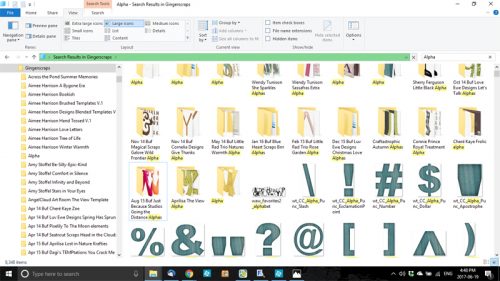
Because I’ve put my alphas into subfolders, my search will turn up both folders and individually named alphas as shown below. Depending on how many folders you have, this search can take awhile, so I usually open another window and start pulling my papers and elements for the layout I’m working on. Some of you may know that I like to mix up items from several kits into a single layout so I might want to use a different alpha than the one the kit provides.
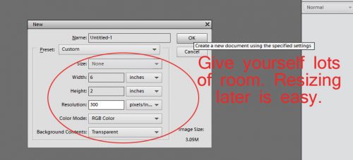
Once I’ve decided on the alpha I want to use and the title I’m going to create, I’ll open a new canvas on my workspace. The size of this canvas isn’t critically important because you’ll be able to resize everything once you’ve put it together to your satisfaction. Just give yourself lots of room.
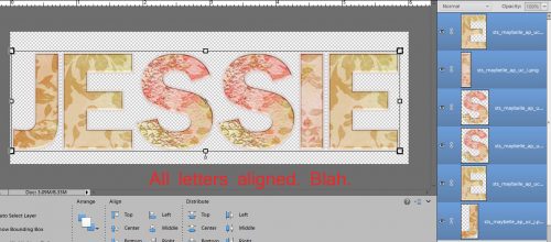
I use Elements 12, which has an unfortunate glitch in it. Everything that is dragged and dropped onto a canvas is transformed into a “smart object” and it takes on the size of the canvas it’s pulled onto. (A workaround for this is to open the element on the workspace and drag it DOWN onto the layout in the Photo Bin, which sizes it according to the original file.) Adobe has taken care of this glitch in later versions – 13 and above – so if your software is more recent, you won’t have to pay attention to this business. The screenshot below shows what V.12 does, which isn’t a big problem if your alpha is ALL-CAPS, like this one from the Seatrout Scraps collection Maybelle. It’s the kit I plan to create my layout with, so of course I had to try it out.

As you can see from the screenshot above, this DOES present a problem in terms of getting all the letters to fit the canvas. I select all the letter layers in the Layers panel so I can resize everything at the same time. WSNH, right?

You can use the Distribute tool to space your letters but it’s not always the best way to do it. I prefer to just eye-ball the spacing. If it looks right, you’ll know. Sometimes I have to resize a couple of times to get everything to fit on the canvas. It’s easy to move blocks of letters together if you’re only worried about a single space being too big or too small; just select the layers those letters are on in the Layers panel and move ’em.

Take a good look at your title to see if you like it. I think all the letters in lockstep looks blah. So I’m going to make some tweaks.
How does this look? Nah….
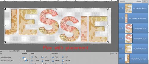
So I moved the last 3 letters over so they overlap where the “s”s are, and that looks better.

How about staggering them with a little overlap? Do I like that better? I think I do!

I wanted to try out several alphas for this title, so next I looked at this one from Ooh La La Scraps‘ Shabby Chic collection. It has both upper- and lowercase letters so there’ll be a couple of extra steps.

To overcome the “smart object” issue, I select all the lower case letters in the Layers panel EXCEPT the letters “b”, “d”, “f”, “g”, “h”, “i”, “j”, “k”, “l”, “p”, “q” “t” and “y”. If the “z” has a tail on it, I don’t select it either. The reason for NOT selecting those is that they either supposed to be the same height as the CAPs, or they extend below the baseline. Instead, I use these letters to guide my resizing efforts. This example doesn’t show you what to do with those letters that dangle, the ones that you DON’T resize. I’ll talk about that below.

The screenshot below shows you what I mean. You can use the bounding box to help you get the size just right – the top of the bounding box is just touching the top of the “i”.

Once again, there’s a size/space problem. Or is there?

I think I like the overlap, so let’s leave it there.

Or, creatively, I might tilt one of the letters slightly. I like to do that especially with the letter “o”, but “s” looks cool tipped too.
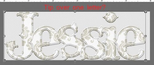
But let’s try a staggered arrangement… remember to shadow the letters that overlap others. Otherwise it will look odd. Maybe not to your eyes, but somebody will notice – and you want them to be overcome by the beauty of your work, not the wonky
missing shadows, right?!

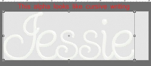
I wanted to try just one more alpha, one that’s sort of a glossy script from Wimpychomers‘ Purple is Her Passion. It’s a little hard to see in the screenshots because it’s white, so you might have to move your head/screen around a bit to see what I’m showing you. If you’re not using guides – lines that make it easier to position things, this might encourage you to do it. This tip will help you to align those dangling “g”s, “p”s, “q”s and “y”s. To create a guide place your cursor on the upper (or far left for a vertical guide) edge and click/drag down (or over) to one of your lowercase letters. You can then resize other letters one at a time, and you can align the danglers by nudging them downward until the top of the letter is even with the top of the resized lowercase ones. When you don’t need the guide any more you can click on View>Guides (or CTRL/CMD>;) and it’ll go away.

This alpha looks a lot like cursive writing, especially after I overlapped the swashes a bit.
I think, for this layout, the title needs a little more oomph. So I’m going to make my canvas a little bit bigger. It’s fine side-to-side, but needs to be a bit bigger top-to-bottom. Image>Resize>Canvas Size (CTRL/CMD>Alt>C) brings up the menu shown below. I just added 1/2 an inch to the height. You would need to take this step if you’re using danglers too, because your baseline isn’t going to rest at the bottom of the canvas.

Then I dropped a paper behind my alpha. I dragged it from the workspace DOWN onto the canvas, and then shrunk it to fit, rather than dragging it UP from the Photo Bin onto the canvas and then resizing up but it isn’t important. Then I clicked on the title thumbnail to select the edges of the alpha.
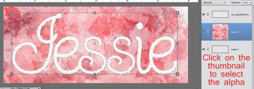
By going to Select>Modify>Expand then keying in 30 pixels, the marching ants will move 30 pixels out from the edges of the alpha.

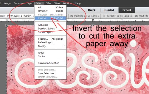
Go back to Select>Inverse (CTRL/CMD>Shift>I) to invert the area selected to the excess paper. Then Delete or CTRL/CMD>X and all that extra paper is cut away.
It looks good, but still needs something. You might also notice that the paper layer thumbnail looks strange. That’s because the paper layer is larger than the canvas so I cropped the canvas to eliminate that. CTRL/CMD>C activates the Crop tool.

See how different the layer thumbnail looks now?
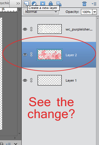
I’m going to put a glittery edge around the paper, so I added a new layer ABOVE the paper cutout, then clicked on the layer thumbnail to get my marching ants. Then I added a stroke – colour doesn’t matter – to the paper. Edit>Stroke (Outline Selection) and a number in the box – 10 pixels here ON THE NEW LAYER gives me something to attach my glitter style to.

Now we’re cookin’! It has so much more presence now.
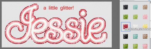
The second-to-last step is to put a slight shadow on the alpha layer so it looks like it’s been written with gel. Then as a very last step I merge or link the layers so when I go to drag the title onto my layout, it all goes together.

So I’ve shown you three different kit alphas and three different options for their use. I hope this has you thinking a little more kindly toward those alphas and I hope to be seeing them in use on your creations! Which option do you think I chose for my layout?
When I first started digi-scrapping, I didn’t use kit alphas much because, like Mary, I found them cumbersome to work with. So many things about my workflow have changed over the years and I’ve found some methods that really work for me, so I’m going to share some of them with you today. One of Mary’s comments was about finding them. Each scrapper is going to do things differently according to how they organize information in their heads, so the following is meant as a suggestion, not a directive.
I’ve read a lot of posts in various places about organizing supplies and I’ve tried lots of methods. The one that works for me best is to use folders. I make folders for everything! When I unzip my downloads, I try very hard to organize them right away; I rename them with the designer’s name and kit name then move them into the folder I’ve created for the store where I bought them. My GingerScraps folder is HUGE!! I also take everything out of the folders the designer has put them in so I can see the whole kit when I open the folder. I used to do that with the alphas too, but found that didn’t work for me. Now they go in a subfolder of the kit folder. (Are you confused yet?) I can tell at a glance which of my kits have matching alphas. They appear in the file with a little arrow in front of the kit name as shown below. That little arrow indicates there is a subfolder. Is this making sense?
Here’s where things get interesting. You can let Windows do the work for you. Other scrappers have talked about tagging every. Single. Element. And. Paper… but you don’t have to! Designers usually call their various bits and bobs simple names like “button”, “paper” or “flower” so if you pop that keyword into the Windows search box in the upper right corner and tell it what area of your hard drive to search, it’ll go get everything with that keyword attached to it.
Because I’ve put my alphas into subfolders, my search will turn up both folders and individually named alphas as shown below. Depending on how many folders you have, this search can take awhile, so I usually open another window and start pulling my papers and elements for the layout I’m working on. Some of you may know that I like to mix up items from several kits into a single layout so I might want to use a different alpha than the one the kit provides.
Once I’ve decided on the alpha I want to use and the title I’m going to create, I’ll open a new canvas on my workspace. The size of this canvas isn’t critically important because you’ll be able to resize everything once you’ve put it together to your satisfaction. Just give yourself lots of room.
I use Elements 12, which has an unfortunate glitch in it. Everything that is dragged and dropped onto a canvas is transformed into a “smart object” and it takes on the size of the canvas it’s pulled onto. (A workaround for this is to open the element on the workspace and drag it DOWN onto the layout in the Photo Bin, which sizes it according to the original file.) Adobe has taken care of this glitch in later versions – 13 and above – so if your software is more recent, you won’t have to pay attention to this business. The screenshot below shows what V.12 does, which isn’t a big problem if your alpha is ALL-CAPS, like this one from the Seatrout Scraps collection Maybelle. It’s the kit I plan to create my layout with, so of course I had to try it out.
As you can see from the screenshot above, this DOES present a problem in terms of getting all the letters to fit the canvas. I select all the letter layers in the Layers panel so I can resize everything at the same time. WSNH, right?
You can use the Distribute tool to space your letters but it’s not always the best way to do it. I prefer to just eye-ball the spacing. If it looks right, you’ll know. Sometimes I have to resize a couple of times to get everything to fit on the canvas. It’s easy to move blocks of letters together if you’re only worried about a single space being too big or too small; just select the layers those letters are on in the Layers panel and move ’em.
Take a good look at your title to see if you like it. I think all the letters in lockstep looks blah. So I’m going to make some tweaks.
How does this look? Nah….
So I moved the last 3 letters over so they overlap where the “s”s are, and that looks better.
How about staggering them with a little overlap? Do I like that better? I think I do!
I wanted to try out several alphas for this title, so next I looked at this one from Ooh La La Scraps‘ Shabby Chic collection. It has both upper- and lowercase letters so there’ll be a couple of extra steps.
To overcome the “smart object” issue, I select all the lower case letters in the Layers panel EXCEPT the letters “b”, “d”, “f”, “g”, “h”, “i”, “j”, “k”, “l”, “p”, “q” “t” and “y”. If the “z” has a tail on it, I don’t select it either. The reason for NOT selecting those is that they either supposed to be the same height as the CAPs, or they extend below the baseline. Instead, I use these letters to guide my resizing efforts. This example doesn’t show you what to do with those letters that dangle, the ones that you DON’T resize. I’ll talk about that below.
The screenshot below shows you what I mean. You can use the bounding box to help you get the size just right – the top of the bounding box is just touching the top of the “i”.
Once again, there’s a size/space problem. Or is there?
I think I like the overlap, so let’s leave it there.
Or, creatively, I might tilt one of the letters slightly. I like to do that especially with the letter “o”, but “s” looks cool tipped too.
But let’s try a staggered arrangement… remember to shadow the letters that overlap others. Otherwise it will look odd. Maybe not to your eyes, but somebody will notice – and you want them to be overcome by the beauty of your work, not the wonky
missing shadows, right?!
I wanted to try just one more alpha, one that’s sort of a glossy script from Wimpychomers‘ Purple is Her Passion. It’s a little hard to see in the screenshots because it’s white, so you might have to move your head/screen around a bit to see what I’m showing you. If you’re not using guides – lines that make it easier to position things, this might encourage you to do it. This tip will help you to align those dangling “g”s, “p”s, “q”s and “y”s. To create a guide place your cursor on the upper (or far left for a vertical guide) edge and click/drag down (or over) to one of your lowercase letters. You can then resize other letters one at a time, and you can align the danglers by nudging them downward until the top of the letter is even with the top of the resized lowercase ones. When you don’t need the guide any more you can click on View>Guides (or CTRL/CMD>;) and it’ll go away.
This alpha looks a lot like cursive writing, especially after I overlapped the swashes a bit.
I think, for this layout, the title needs a little more oomph. So I’m going to make my canvas a little bit bigger. It’s fine side-to-side, but needs to be a bit bigger top-to-bottom. Image>Resize>Canvas Size (CTRL/CMD>Alt>C) brings up the menu shown below. I just added 1/2 an inch to the height. You would need to take this step if you’re using danglers too, because your baseline isn’t going to rest at the bottom of the canvas.
Then I dropped a paper behind my alpha. I dragged it from the workspace DOWN onto the canvas, and then shrunk it to fit, rather than dragging it UP from the Photo Bin onto the canvas and then resizing up but it isn’t important. Then I clicked on the title thumbnail to select the edges of the alpha.
By going to Select>Modify>Expand then keying in 30 pixels, the marching ants will move 30 pixels out from the edges of the alpha.
Go back to Select>Inverse (CTRL/CMD>Shift>I) to invert the area selected to the excess paper. Then Delete or CTRL/CMD>X and all that extra paper is cut away.
It looks good, but still needs something. You might also notice that the paper layer thumbnail looks strange. That’s because the paper layer is larger than the canvas so I cropped the canvas to eliminate that. CTRL/CMD>C activates the Crop tool.
See how different the layer thumbnail looks now?
I’m going to put a glittery edge around the paper, so I added a new layer ABOVE the paper cutout, then clicked on the layer thumbnail to get my marching ants. Then I added a stroke – colour doesn’t matter – to the paper. Edit>Stroke (Outline Selection) and a number in the box – 10 pixels here ON THE NEW LAYER gives me something to attach my glitter style to.
Now we’re cookin’! It has so much more presence now.
The second-to-last step is to put a slight shadow on the alpha layer so it looks like it’s been written with gel. Then as a very last step I merge or link the layers so when I go to drag the title onto my layout, it all goes together.
So I’ve shown you three different kit alphas and three different options for their use. I hope this has you thinking a little more kindly toward those alphas and I hope to be seeing them in use on your creations! Which option do you think I chose for my layout?

