
Navigation
Install the app
How to install the app on iOS
Follow along with the video below to see how to install our site as a web app on your home screen.
Note: This feature may not be available in some browsers.
More options
You are using an out of date browser. It may not display this or other websites correctly.
You should upgrade or use an alternative browser.
You should upgrade or use an alternative browser.
Bakers' Best 8/6 - 8/12
- Thread starter lorigaud
- Start date
- Status
- Not open for further replies.


becky_a
Active member
IMHO, sylvia hit this one out of the ballpark. Love the simplicity of the design and the wonderful use of white space.


quilter
Active member
I've tried combining bold patterns bright colors and end up with a hot mess. 
chigirl did it with such finesse I smiled the second I saw it. She doesn't lose her great photo the process.

Karen M In FL
New member
This layout by route66. This layout really jumps out at to me with the contrast of the red and black and white combo. The few simple elements really add to the page.


Jill
Sugar Cookie : GingerScraps Praise Team
This week I nominated this LO by Chaos Lounge


Route66
Well-known member
Awe...thanks Karen!

Peggy
New member
my pick is for Imperio beautiful lo! I love the whole flow to it and design. it is so relaxing and beautifully done!


ScrappyPenguin
New member
I nominate this page by LUV EWE DESIGNS. I love the fun scattered feeling of all the school elements.
https://gallery.gingerscraps.net/showphoto.php?photo=313563&title=back-to-school&cat=500
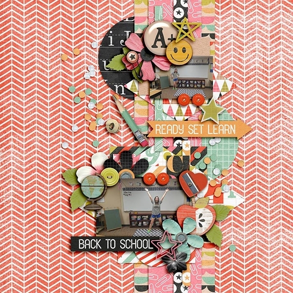
https://gallery.gingerscraps.net/showphoto.php?photo=313563&title=back-to-school&cat=500

Chaos Lounge
Member
Thanks so much Jill!!

glee
Sugar Cookie : GingerScraps Praise Team
check out this stunning example of gorgeous clustering by Pippin:

https://gallery.gingerscraps.net/showphoto.php?photo=314018&title=je-t-aime-paris&cat=500
https://gallery.gingerscraps.net/showphoto.php?photo=314018&title=je-t-aime-paris&cat=500

gwany1999
Active member
I am really digging this page by tomosia. I really like how much white space this page has with all but a couple of the papers and elements on one side of the page. The black and white photo with the colored elements really stands out.


lissiejo
Active member
I am so excited to nominate dorannmwin! I absolutely love how she used an element as part of the title!


Pippin
GingerScraps Site Creative Team
Thank you so much Glee, for the nomination.

snojewel
Sugar Cookie : GingerScraps Praise Team
I love this fabulous page by FILIPPOK. I love her adorable photos, well placed little flower clusters and all the special little details!

https://gallery.gingerscraps.net/showphoto.php?photo=314173&title=outdoorsy-fishing&cat=500
https://gallery.gingerscraps.net/showphoto.php?photo=314173&title=outdoorsy-fishing&cat=500

FILIPPOK
New member
Many thanks snojewel! I'm very glad that van likes my page.
Pippin
GingerScraps Site Creative Team
My nomination is Carefree by Cherrylej. Such a wonderful page.


Caylynn
New member
I have a soft spot for cat layouts, as pretty much everyone knows! My choice for Baker's Best this week by deegazzo:

https://gallery.gingerscraps.net/showphoto.php?photo=314116&title=purrfect&cat=952
https://gallery.gingerscraps.net/showphoto.php?photo=314116&title=purrfect&cat=952

mskinsey
New member
I would like to nominate Fish Friends, a sweet layout with amazing depth by Lisa Campbell, for Baker's Best Wk2 (8/6 to 8/12). Besides the charming photo and excellent overall color balance, if you look closely, you too will see a starburst pattern that adds perspective to the background and bokeh that add greater depth to the water. 


Got2Scrap
Sugar Cookie : GingerScraps Praise Team
I would like to nominate Car Cart by tjscraps. I love the way the black background makes the other excellent paper selection pop. The pictures are adorable. I love the way she used the shopping cart. The tucking of the word tags and UPC code into the clustering is superb.

Link to Car Cart in the Gallery: https://gallery.gingerscraps.net/showphoto.php?photo=314537&title=car-cart&cat=931
Link to Car Cart in the Gallery: https://gallery.gingerscraps.net/showphoto.php?photo=314537&title=car-cart&cat=931

tjscraps
New member
Thanks so much Tina for nominating my page!!! 


- Status
- Not open for further replies.