• 🆘 Need Help? We’re Here for You!

    Have a question or need assistance? You’re in the right place! Whether you're new to GingerScraps or just need a little guidance, feel free to ask here. Our amazing admins and helpful community members are always happy to lend a hand. 💖

    Be sure to check out these helpful areas too:

    🔧 If you’re having trouble with an order or product download, please visit our Support Desk - we’re happy to help!

Constructive Criticism PLEASE!

trina513

Designer: Dear Friends Designs
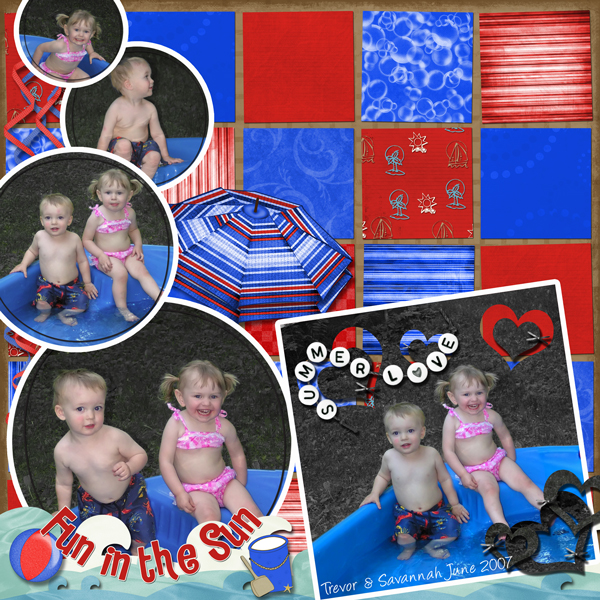
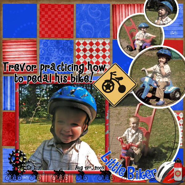
Looking for some CC please!! I liked the template - but I think it's just too much - but I've played with them long enough - TIME TO MOVE ON! :36_11_20:

Please help - what can I do to make these better? Just "scrap" the whole squared/tiled background alltogether?

Thanks!


It's cute Trina, but the background is a little busy, although it must have taken you forever...what if you changed the opacity of the BG "tiled" pieces to make them a little muted...idk...maybe...
 
i really think is beautiful, but if you feel its to much you could try doing an effect to take down the color or maybe a blur? i wouldnt change it tho.
 
LOL - you're right Julie - it did take forever - which is one reason I don't want to give up on it too quickly....LOL!!

Maybe I'll try to tone them down a bit - but I'm afraid the colors would look funny together then....we'll see! :) Thanks girls!
 
If those ideas don't work, try getting rid of the umbrella in the first one, the colors of the umbrella against the same color backgrounds is a bit much. Not sure how it will look with the tiles muted though so try that first.
 
That was my same suggestion as they said.

You want your photos to be the focal point of the layout. Your eyes go to the busy background first and get stuck there. You want your eye to go to the photos first, then drift about the page.

It is very difficult to use patterned papers, or even bright papers, and keep the photos the focal point. This is why I tend to shy away from patterns and brights myself.
 
Thanks ladies!

Ok - I subdued the backgrounds a bit - is this ok now? Or should i do more? Should I totally take the color out and do a sepia? Any other suggestions now? LOL!

Trevor-182-Summer-Love.jpg

Trevor-183-Biker-Boy_sm.jpg
 
Your pictures do seem to totally stand our more. What do you think? Do YOU like it? It's your art and your cute kids :) You know what I really like about these pages is that they totally remind me of traditional paper scrapped pages. Reminds me of the paper days :) I do miss paper scrapping sometimes...a little :)
 
LOL Julie! I know - ONCE in a while I kinda miss the mess of papers - but then I think about the mess and don't miss it! LOL!

I'm not sure I love them yet - but I'm 2 years behind - and do I really have to LOVE all pages? I'm just happy to get them in a book! LOL....is that bad?!?!?
 
Back
Top